B2B SaaS Dashboard
I joined Feat Paper just as the team was racing to ship the biggest update to its dashboard yet, plus a brand-new Figma plug-in. I dove straight in, and in about two months, working hand in hand with AI, designed and shipped a body of work that would normally take a small team far longer, without trading away quality. This case study is really about that: delivering production-grade product design at a startup's pace.
Where I came in
→I joined mid-sprint, as the biggest dashboard update yet and a brand-new Figma plug-in were about to ship. The real constraint wasn't a feature. It was speed without dropping quality.
Feat Paper turns a sent document into something you can learn from: who opened it, how far they read, where they stopped. For its 51K monthly users, that intelligence only matters if the product delivering it is good, and shipped. When I arrived, the team was mid-sprint on the largest dashboard update in the product's history, with a Figma, PowerPoint, and Adobe Express plug-in queued right behind it.
There was no runway for a slow ramp. The bet the founders were making, and the one this case study is really about, was whether one designer working hand in hand with AI could carry product strategy, UX, UX writing, and production front-end code at the pace a startup actually ships. What follows is the work that came out of roughly two months of it: designed, written, and merged into the live codebase, not handed off as pictures.
The front door
→Most returning sessions cut straight past the document list to reach analytics. The list was a hallway, so I made the front door answer the real question: what happened while I was gone?
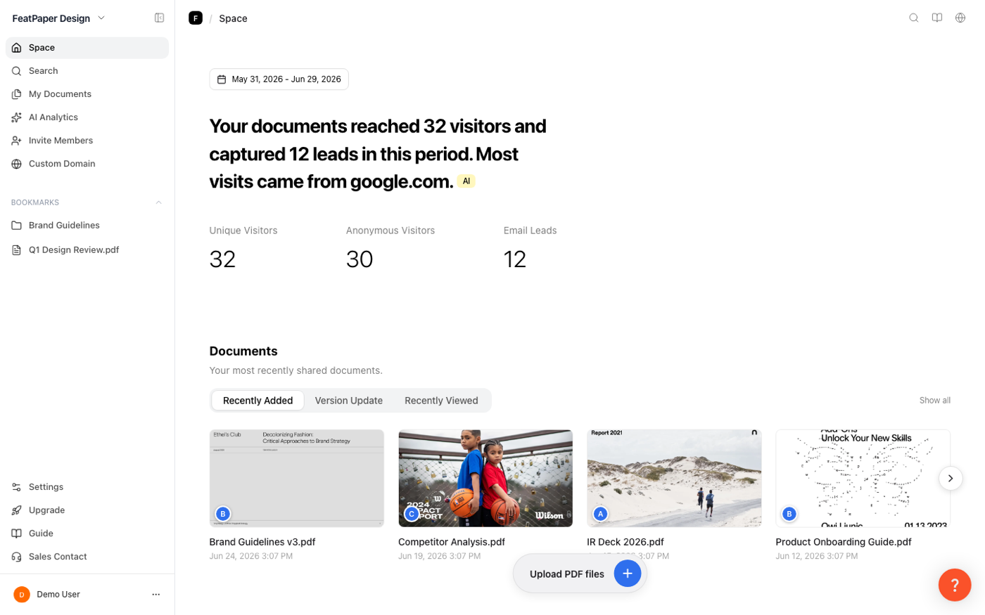
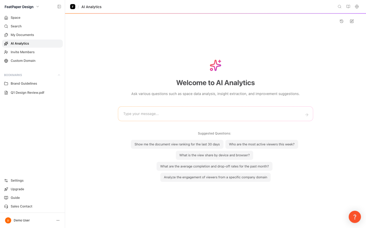
The old dashboard landed every user on their document list, and everyone was used to it. But the behavior said users weren't there for storage: returning sessions cut through the list to some document's analytics. So I argued for, designed, and shipped an analytics-first home. It opens with one plain-language sentence, “Your documents reached 32 visitors and captured 12 leads,” because a payoff that must land in seconds can't require reading a dashboard. Below it: three KPI tiles (every tile I cut was a tax refunded to that sentence) and the recently shared documents, since the doc you shared yesterday is the one you're nervous about.
I de-risked the argument by prototyping the page on existing APIs so the founders could feel it before any backend work, then specified the single overview endpoint that replaced the prototype's request fan-out. The API contract was part of the design. And for the questions no chart of mine predicted, I shipped AI Analytics beside it: ask in your own language, Korean, English, or Japanese, and the answer streams back in it.
The plug-in
→The plug-in has one job: turn a file you already made into a trackable document, without leaving the tool you made it in.
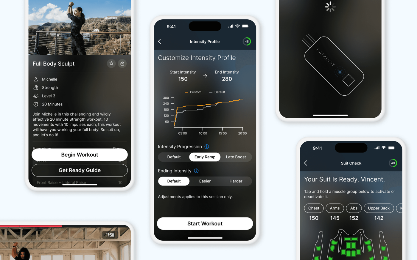
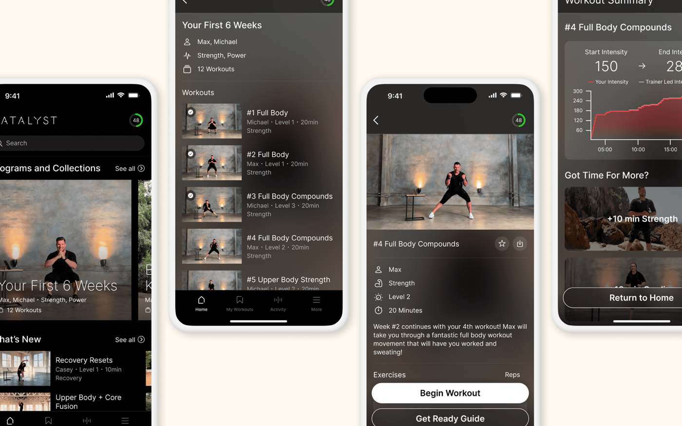
Feat Paper's product is readership analytics, but before anyone can see who read a document, they have to get it into Feat Paper. The plug-in is that on-ramp. It lives inside the tools people already work in, Figma, PowerPoint, and Adobe Express, and does one thing above all else: it exports the file you already made into a trackable Feat document, and hands you a share link that shows you who reads it.
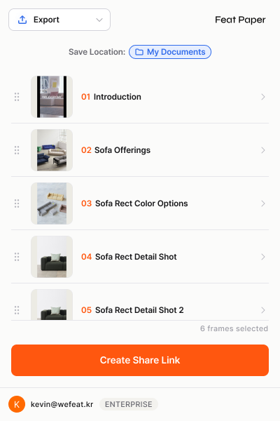
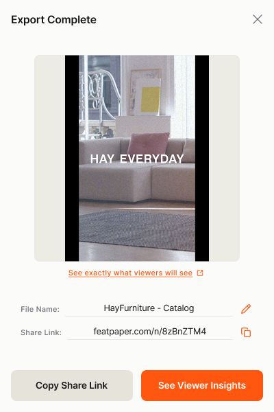
That single purpose drove every decision. You open the plug-in, pick your frames or slides, and Feat exports them into a document with its own share link. Send the link, and the analytics begin: who opened it, how far they read, which page held them longest. Start in your favorite tool, share anywhere, and watch what happens next.
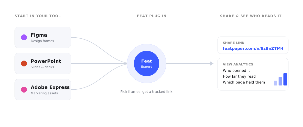
Here is that core flow inside the plug-in itself: pick the frames to export, watch the document generate, and land on a tracked share link, all without leaving the canvas.
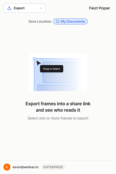
Beyond exporting, the plug-in can also insert media and move files between the tools people already use, so it works as a two-way bridge between where documents get made and where they get tracked.
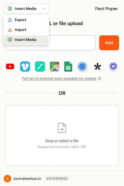
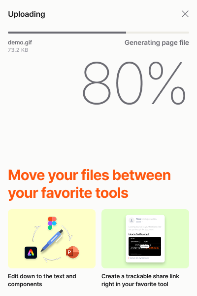
This was a focused, ship-fast project. I designed and built it working full time with Claude Design and Claude Code, taking it from concept to a final, high-quality plug-in far faster than a hand-built effort would have allowed.
The performance tab
→Analytics only matter if they tell you what to do next. The performance tab was built to be acted on, not just read.
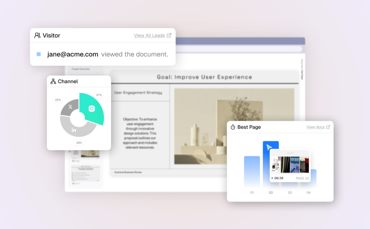
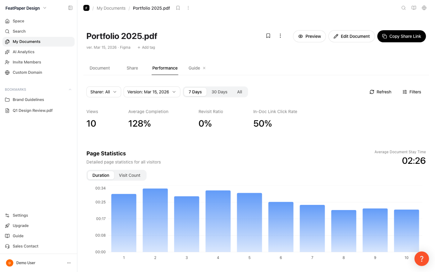
The performance tab is the heart of the product. It's where a sender finds out what actually happened to a document after they shared it, and the brief I set for it was that every number had to be actionable, not just impressive. So it leads with the questions a sender actually asks: who viewed this, from which channel, and which page held their attention.
The decision that mattered most here was structural, not visual. The tab packs eight cards across four views, and for the accounts that matter most, the ones with thousands of readers, the old version took roughly 46 seconds to load or timed out entirely. So I rebuilt the whole tab on a single shared dataset: one cumulative fetch feeds every card, it streams in progressively behind a live count instead of a dead spinner, and every filter re-slices that same data on the client with no new request. The payoff is pointed. The sender with the most to act on, exactly the customer the product is built for, is the one who now gets an instant, fully interactive view instead of a spinner.
That one dataset is also what lets the cards stay honest and consistent: because every number is computed from the same source, a page only counts as read once someone actually stays on it, and the whole workspace agrees with itself no matter how you filter. A per-visitor list then turns anonymous traffic into named leads ranked by engagement and exportable to a spreadsheet, so the first thing a sender sees is who to follow up with, and when.
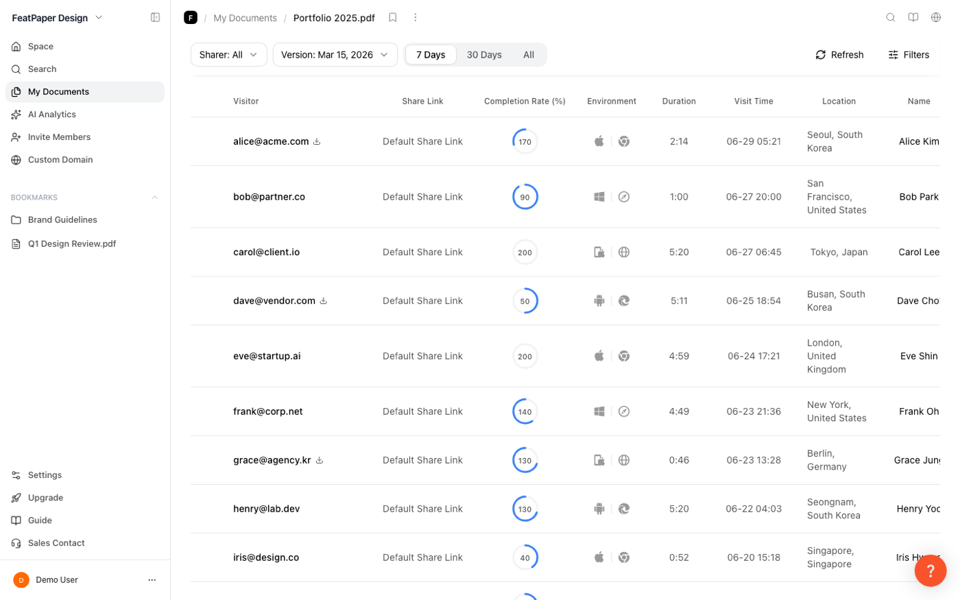
The same data powers the rest of the workspace: a page-by-page analytics view, and an AI chat that answers plain-language questions about who read what, in the user's own language.
Designing for user, business, and engineering
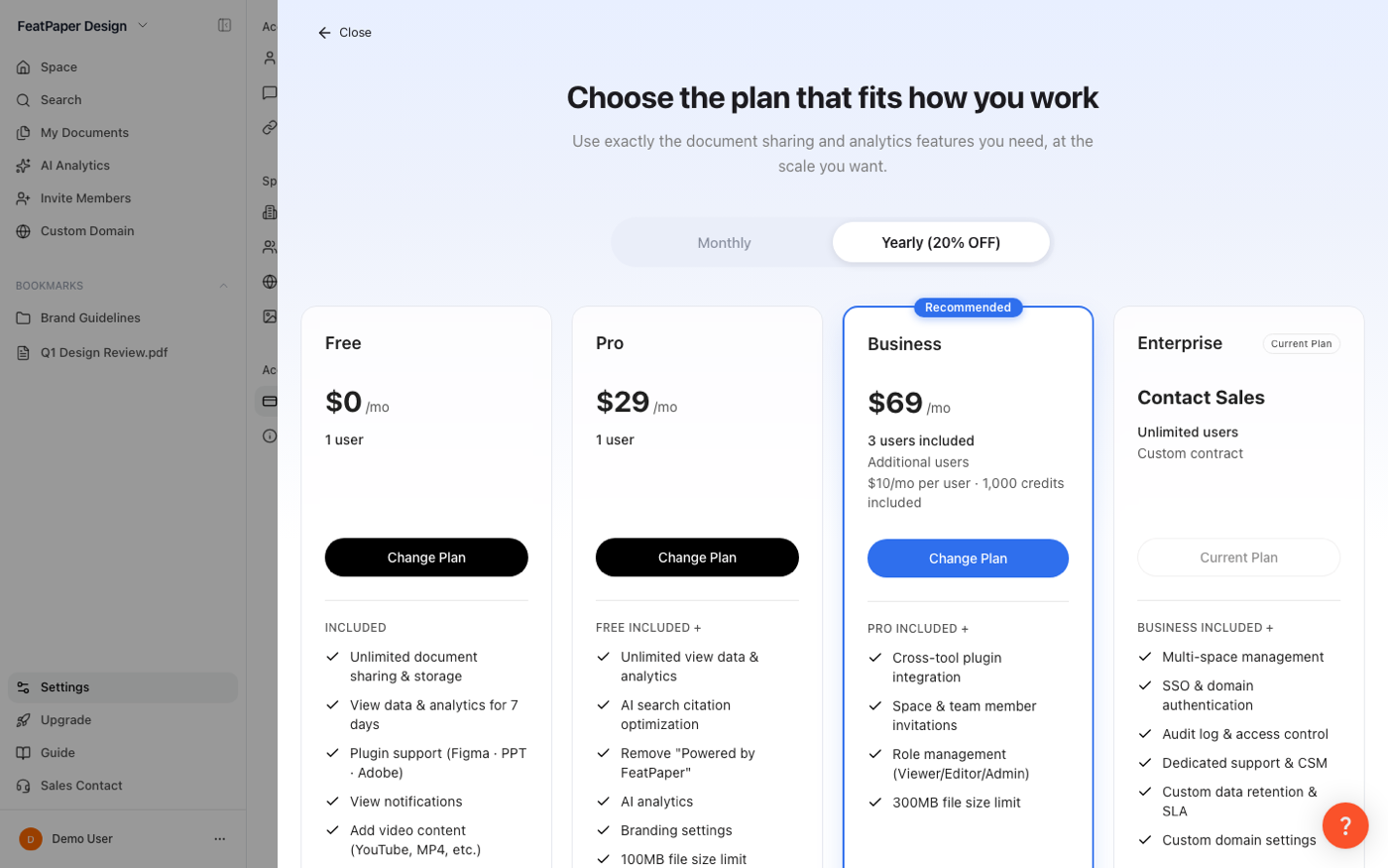
→The hard parts weren't visual. They were designing experiences that made financial and technical sense at the same time as user sense.
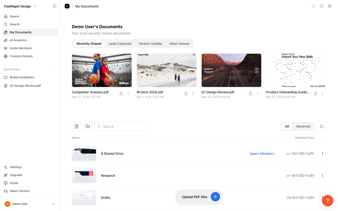
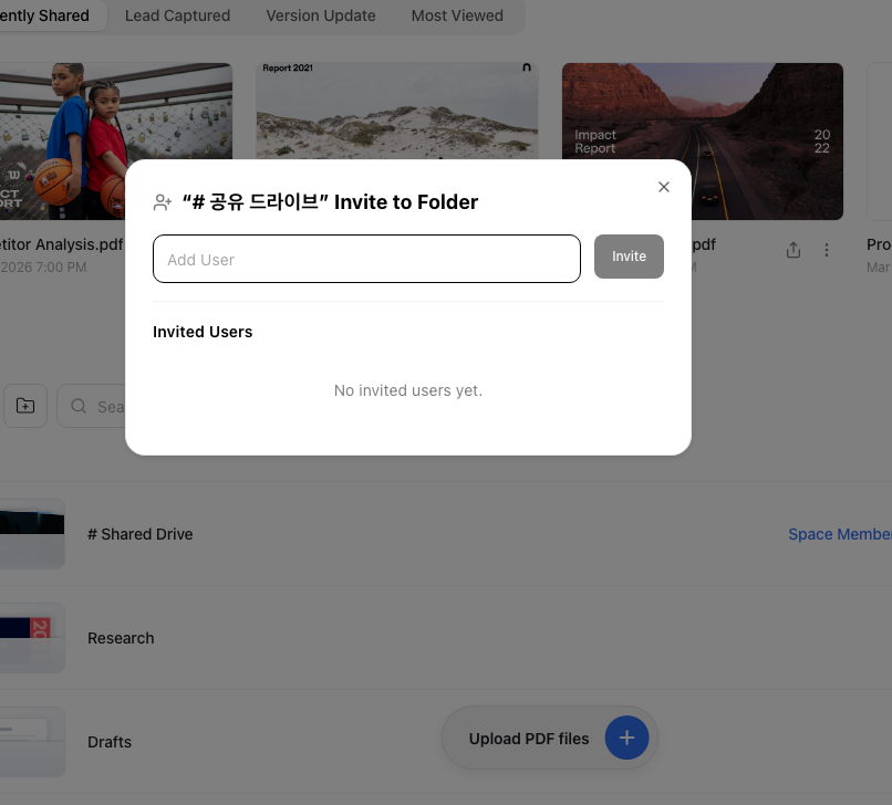
Shipping fast at a startup means every design has to satisfy three constraints at once: the user, the business, and what engineering can actually build in the window. Several of the calls that mattered most lived exactly at that intersection.
Each of these asked me to understand the business model and the engineering limits quickly, then design something that held up on all three fronts at once.
Results & reflection
The through-line here is simple. I'm quick to understand the user, the business, and the engineering constraints, and by fully using AI tools I designed and delivered new products and features in a fraction of the time it would take to do it by hand, alone. The dashboard update and the plug-in both shipped in about two months, at production quality, because the judgment stayed mine and the leverage came from AI.
That's the part I'd want a team to take from this. Working with AI didn't make the decisions for me and it didn't lower the bar. It let one designer clear that bar across more of the stack than a startup usually gets from a single hire, and clear it at the speed the moment demanded. The dashboard work continues, and the plug-in is in final handoff.